
When the Tools Meant to Help Start Getting in the Way
Before the redesign, working in Tres felt like juggling fire.
Agents told us:
“I have to open five tabs just to answer one client”
“It’s hard to see who’s booked what, where, and when”
“I spend more time managing the system than helping people”
This wasn’t just inefficient—it was costing bookings, time, and trust.
So we set out to simplify, modernize, and bring clarity to chaos.

Listening First

Our team interviewed:
· Independent travel agents
· Sales managers
· Admins juggling hundreds of clients
We didn’t just ask what they needed. We watched how they worked. And we saw the pain points up close
· Disconnected tools
· Cluttered dashboards
· No central view of client activity
· Missed opportunities hiding in plain sight
One agent said:
“Every trip felt like starting from scratch.”
So we asked: What if everything was in one place and just made sense?

Melissa, 36
Melissa’s tired of switching between tools. She wants one simple system to manage clients, bookings, and communication all in one place.

Lucas , 27
Lucas is learning fast but stuck with clunky software. He needs something easy to use, so he can focus on helping clients, not fighting the system.

Sofia, 46
Sofia leads a busy team. She needs clear insights and smoother workflows to keep things running efficiently without the tech headaches.
Finding the Gaps
We did a full audit of the old platform and its competitors
The market had options—but none were tailored for the daily hustle of travel agents.
That’s where Tres could shine.
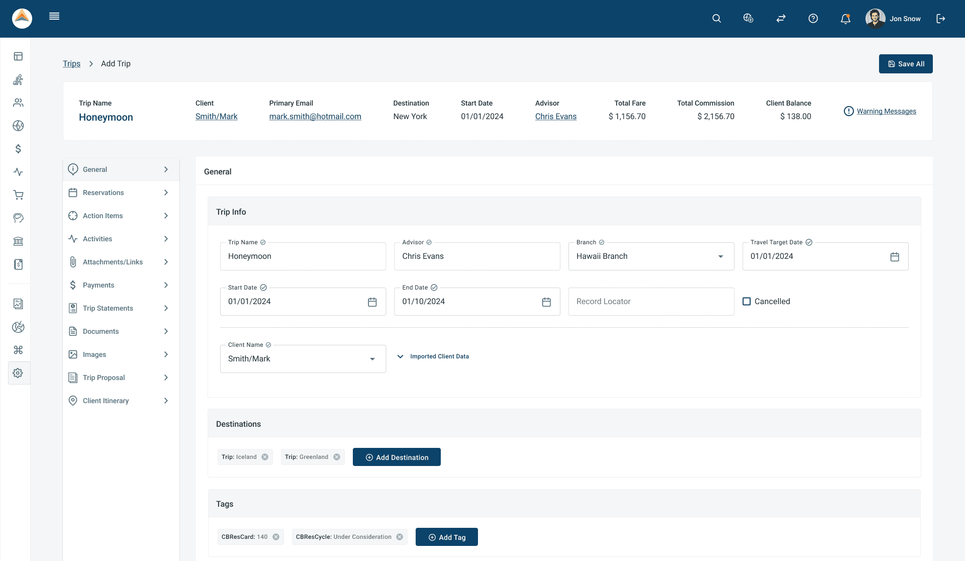
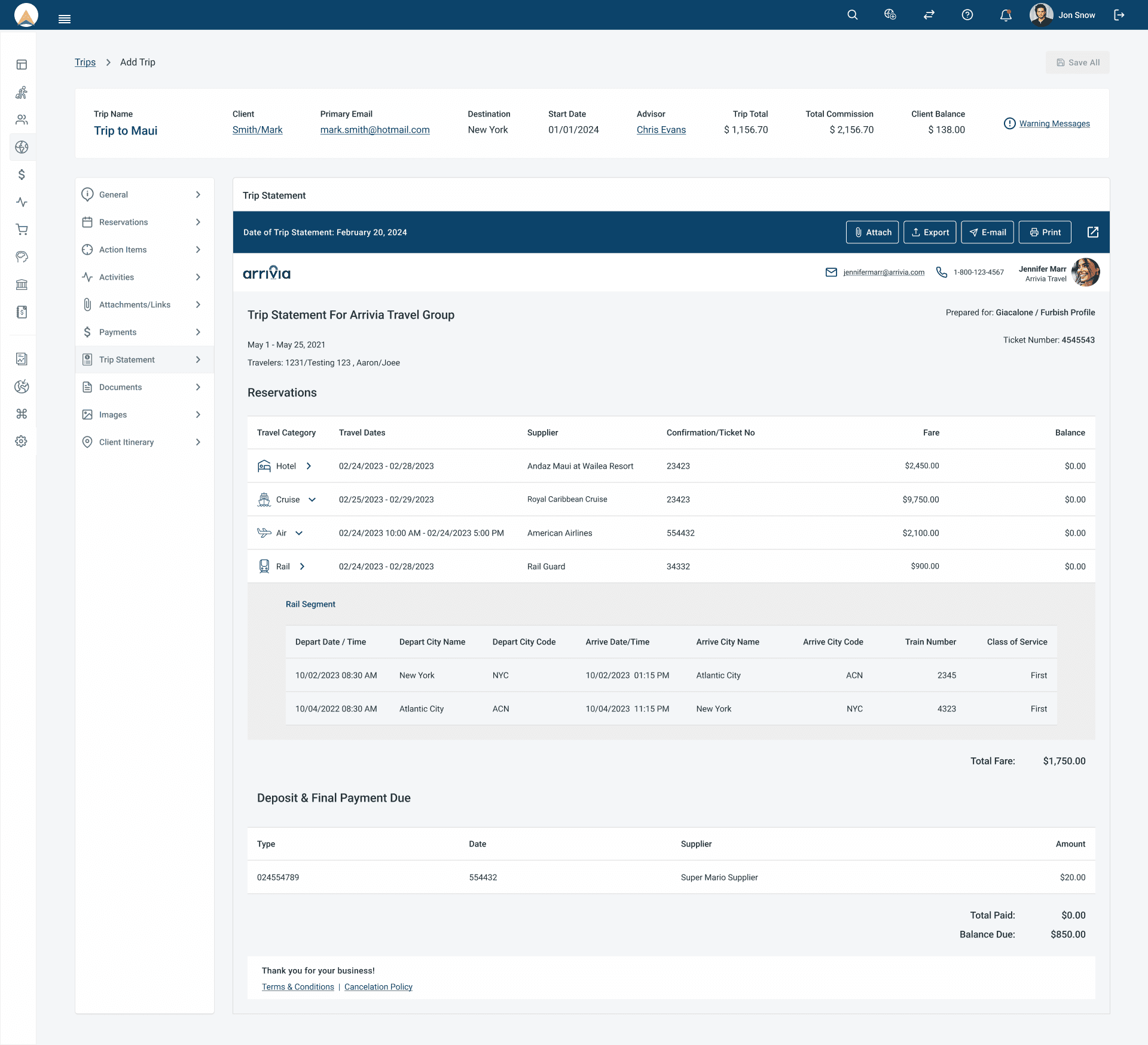
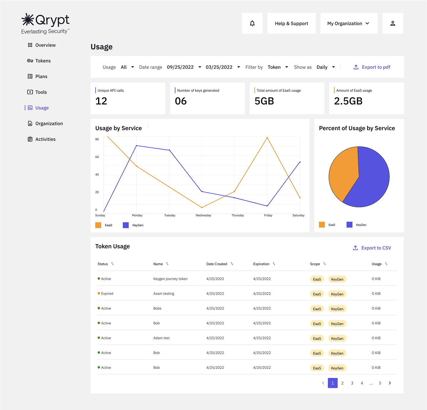
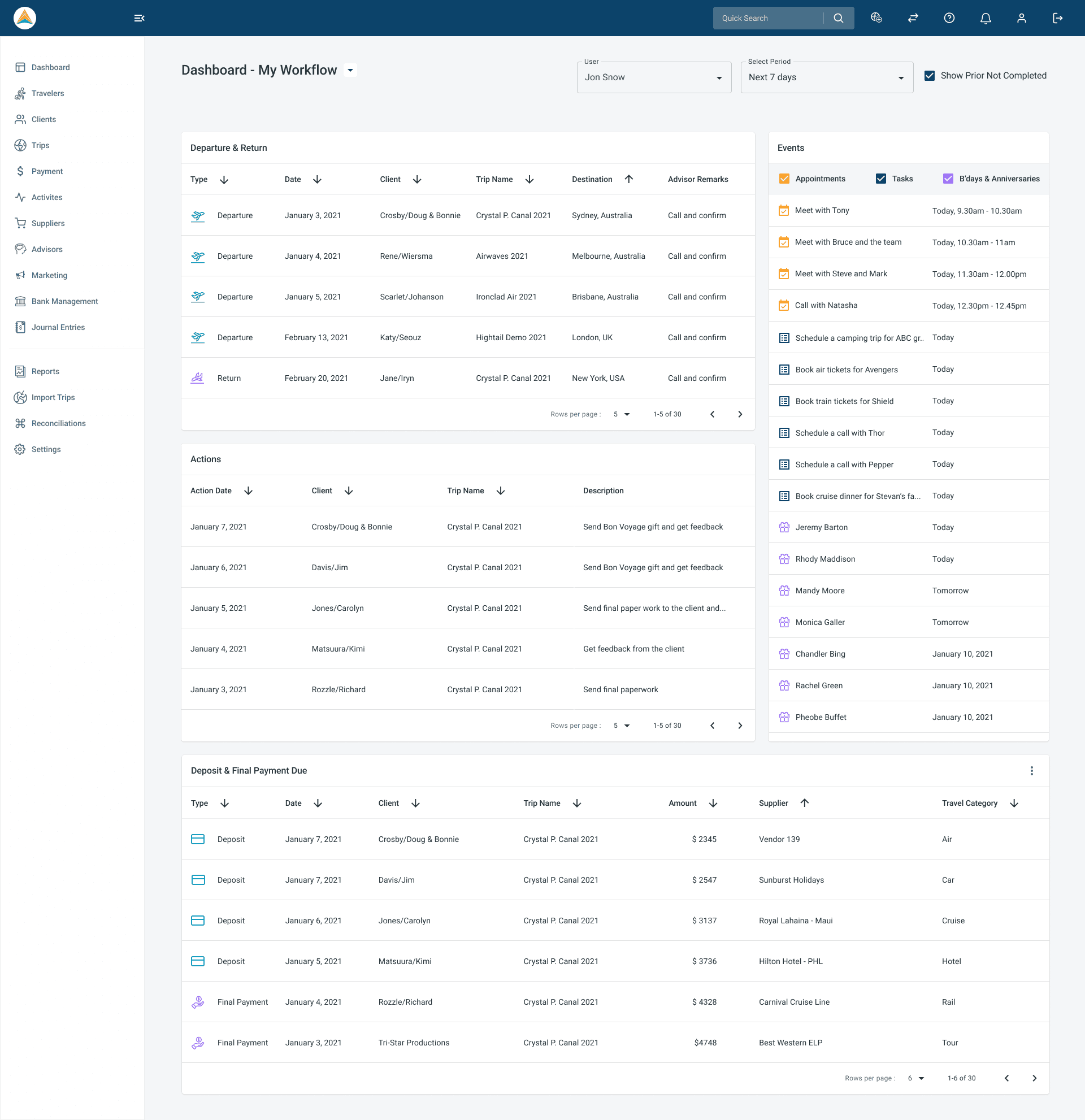
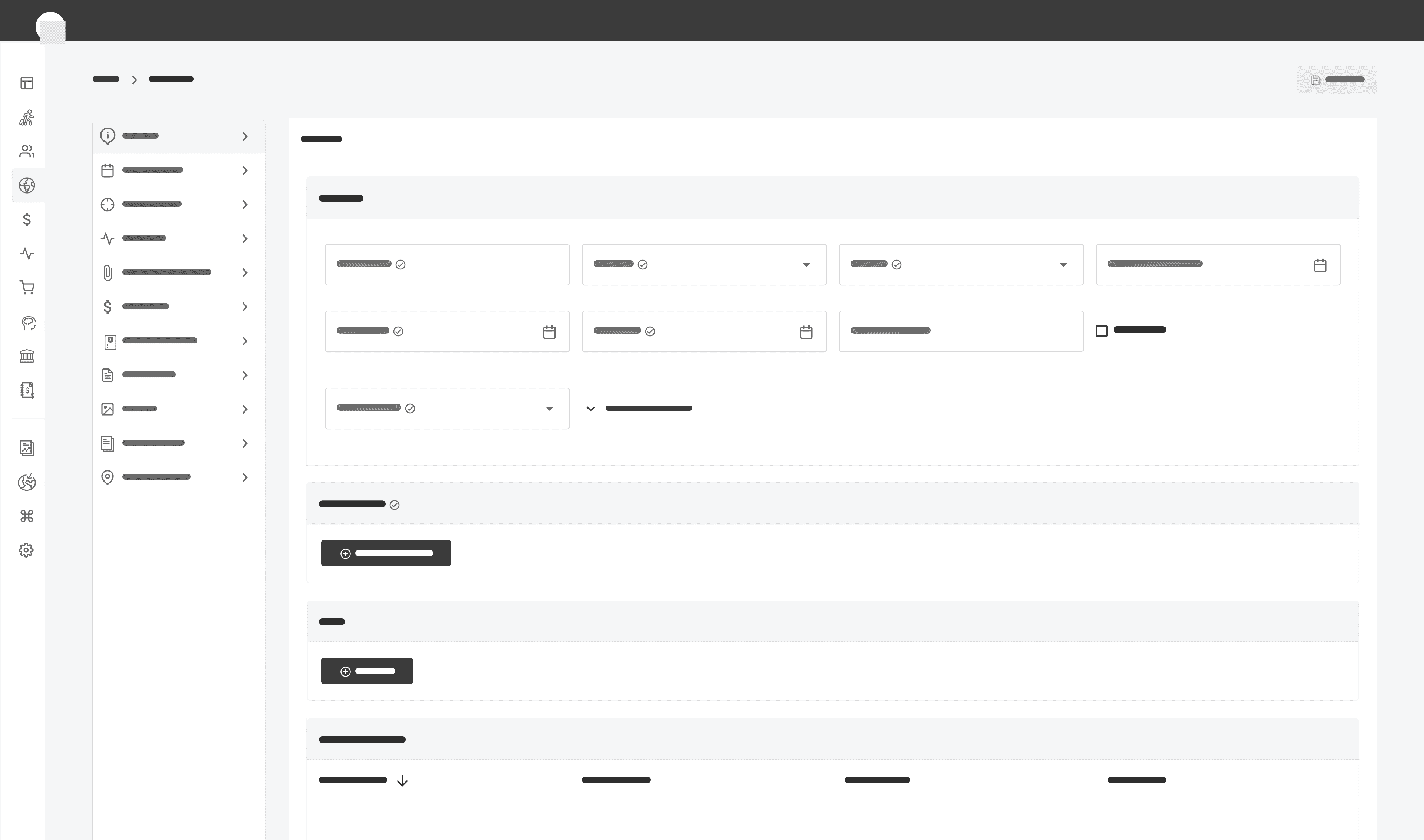
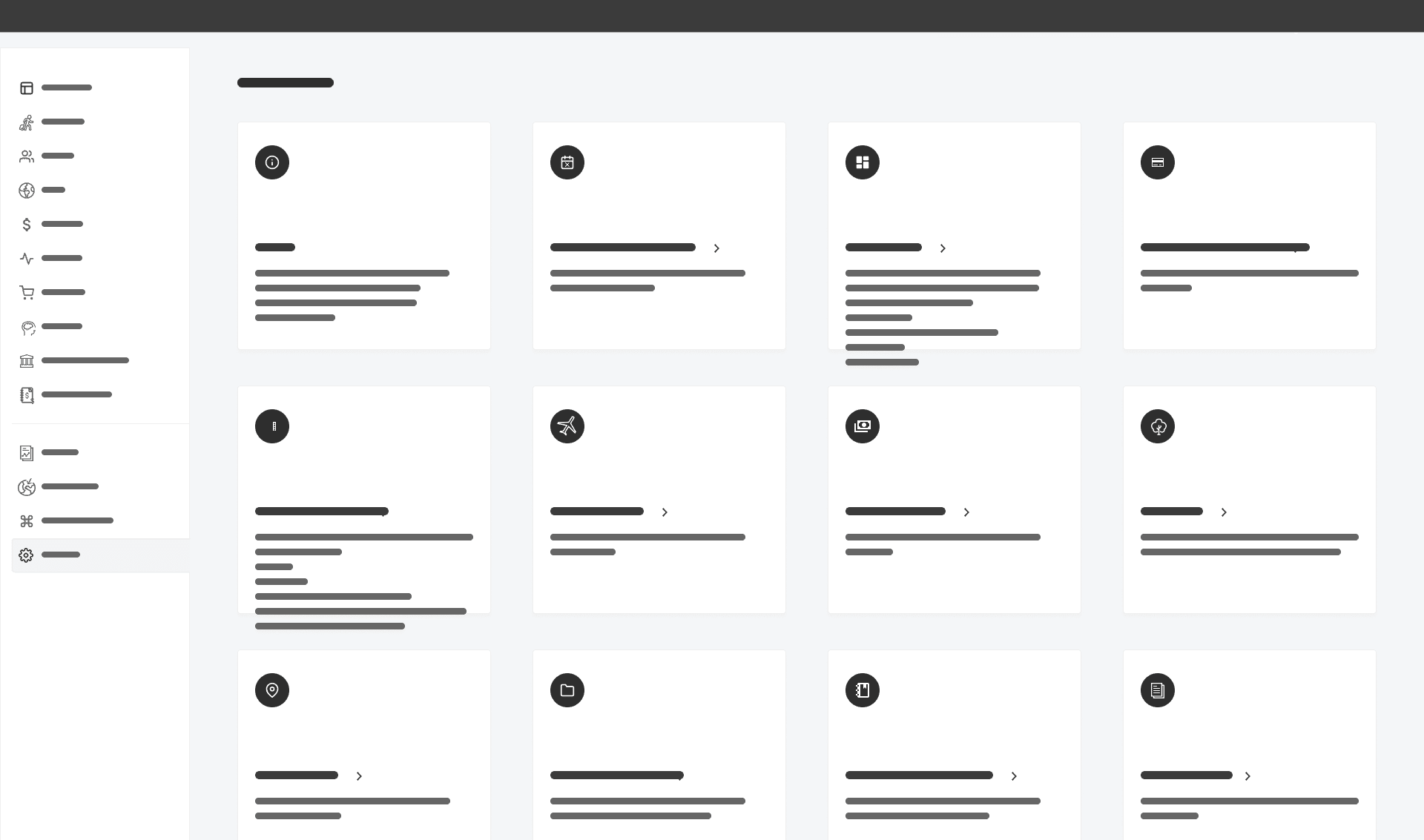
What We Built
We designed a new Tres from the ground up—centered on clarity, speed, and context.
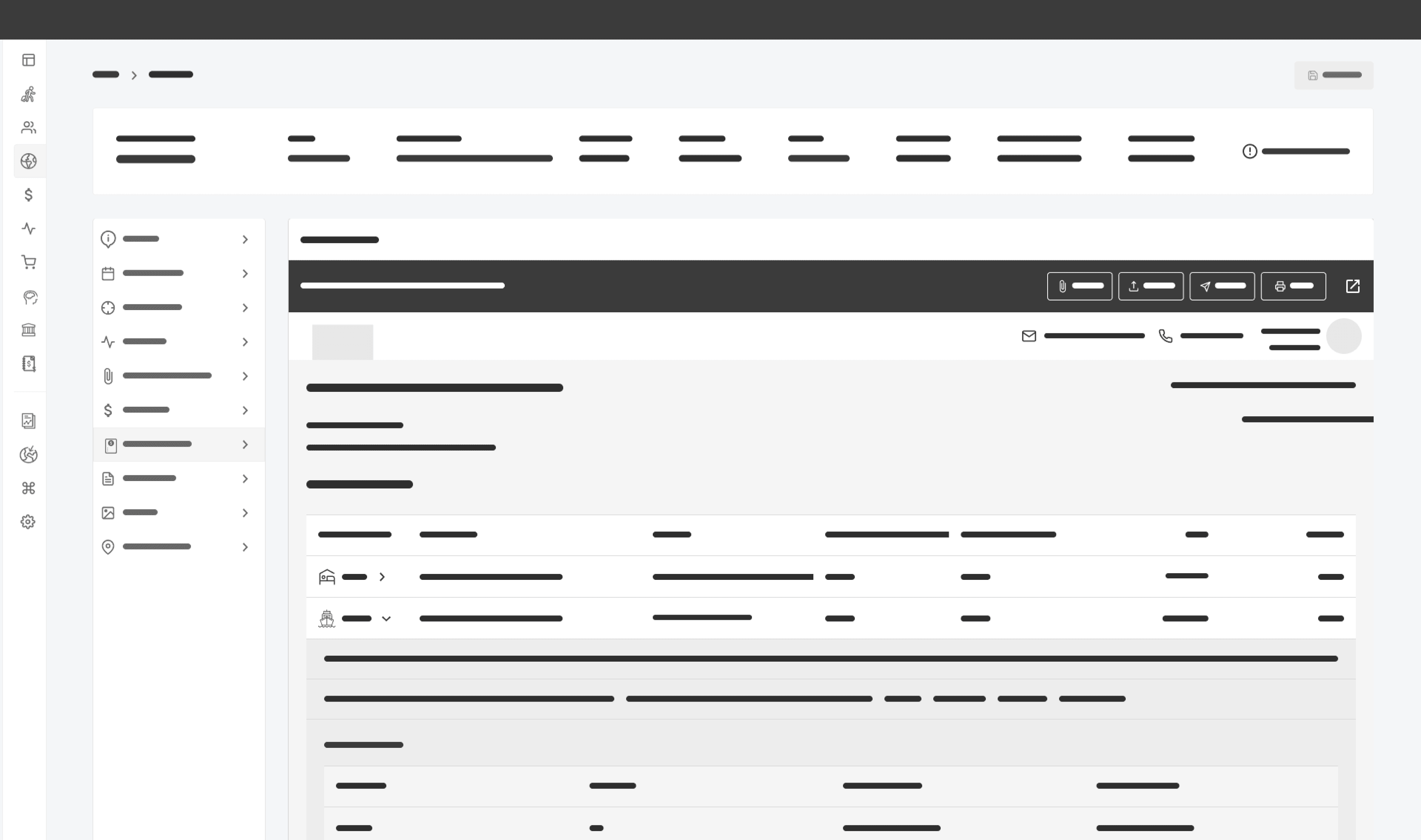
User Flow
We mapped the full experience of a user managing trips and finances from first login to generating financial insights.

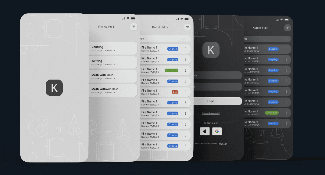
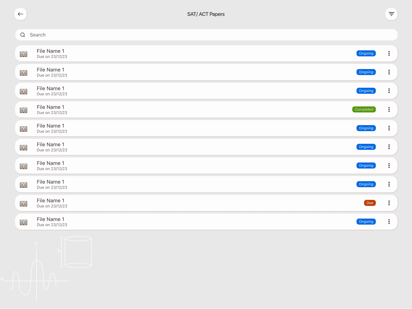
Wireframes
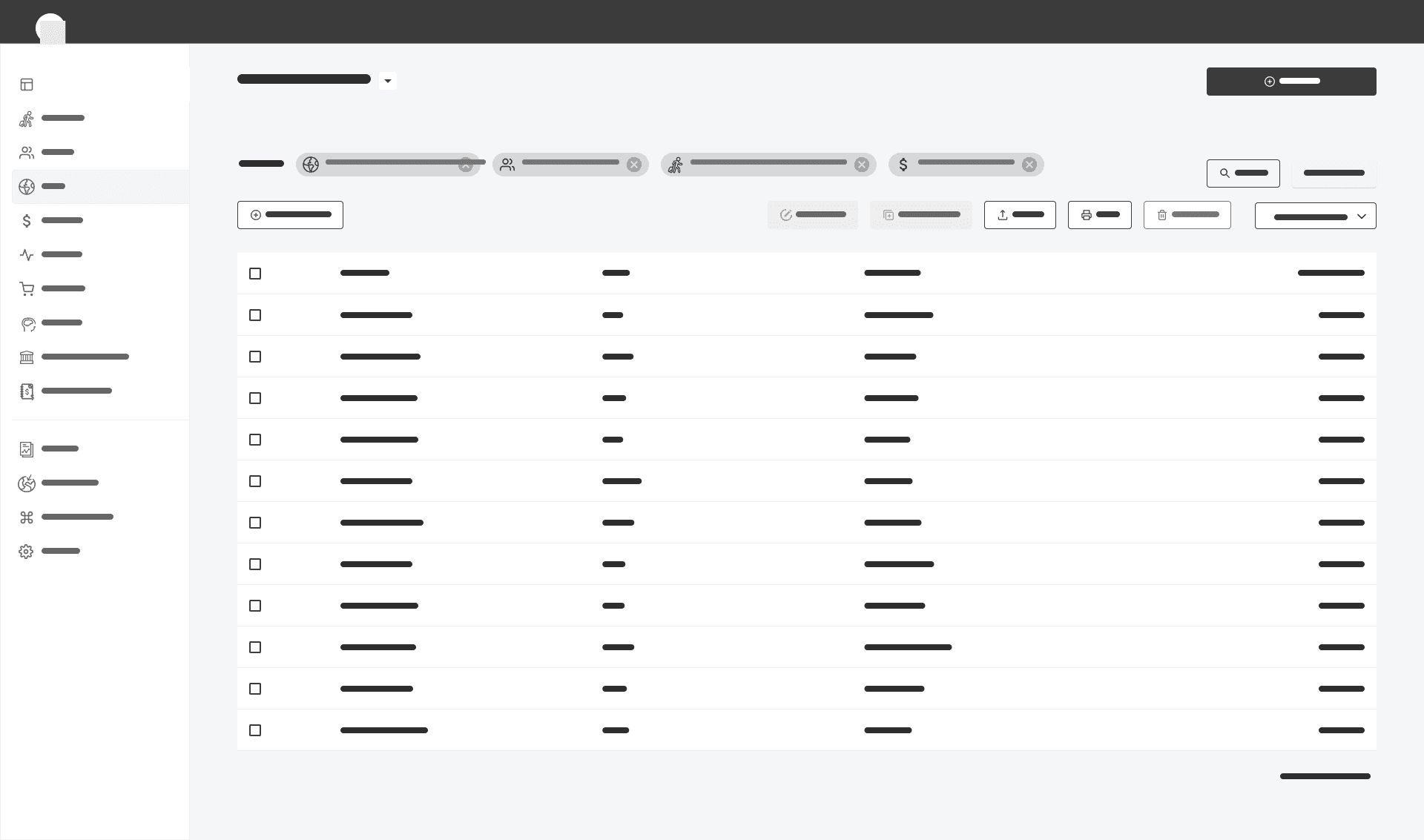
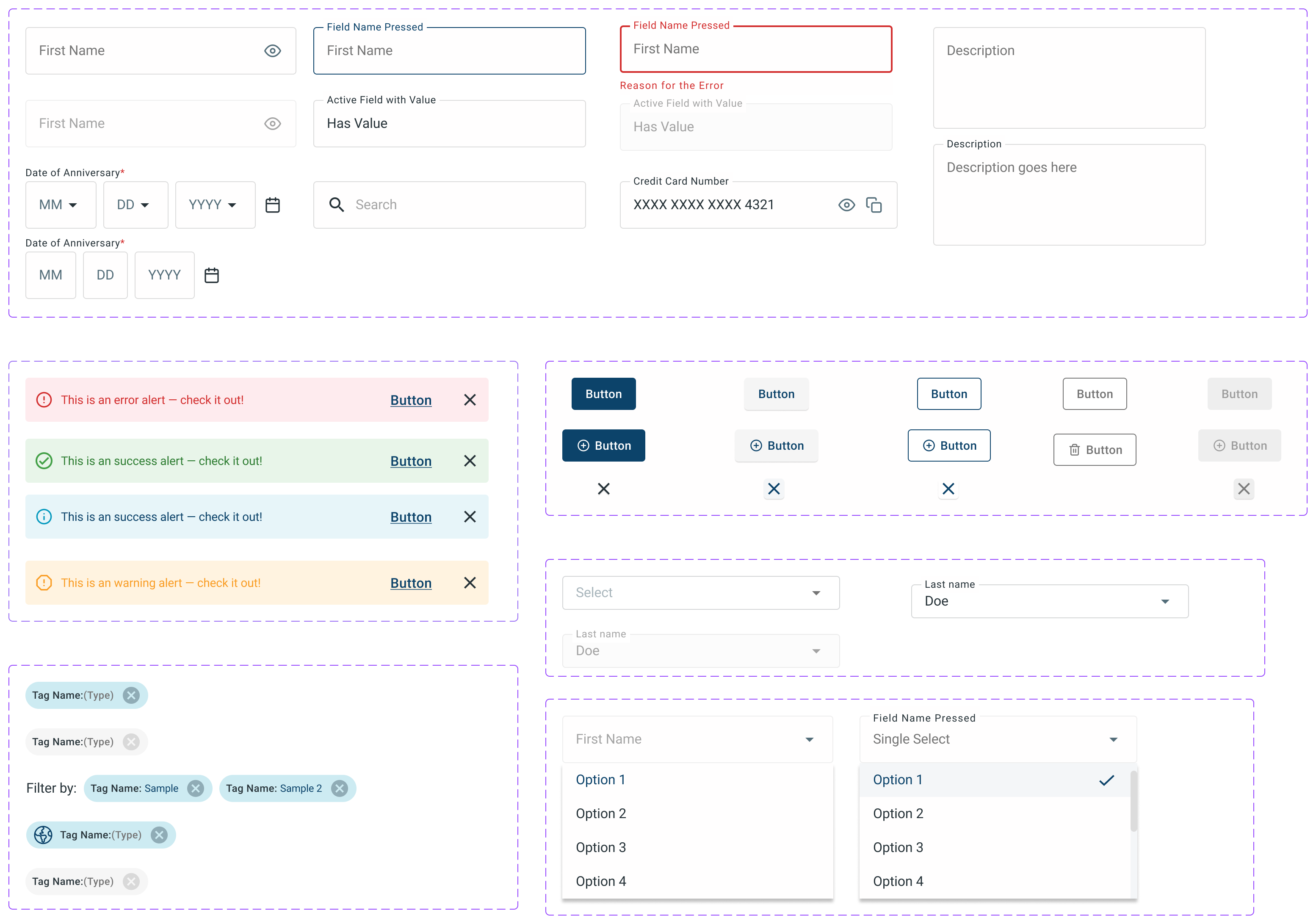
Design System
Components
How It Works

What We Learned (and Fixed)
We ran usability tests with real travel agents.
Here’s what they helped us fix:
· Confusing card hierarchy → Updated layout for better scanability
· Unclear trip timelines → Replaced with visual progress trackers
· Missing next steps → Added color-coded action nudges
One agent said:
“It finally feels like this system works with me not against me.”
Why It Matters
Travel is about experience. The CRM should reflect that.
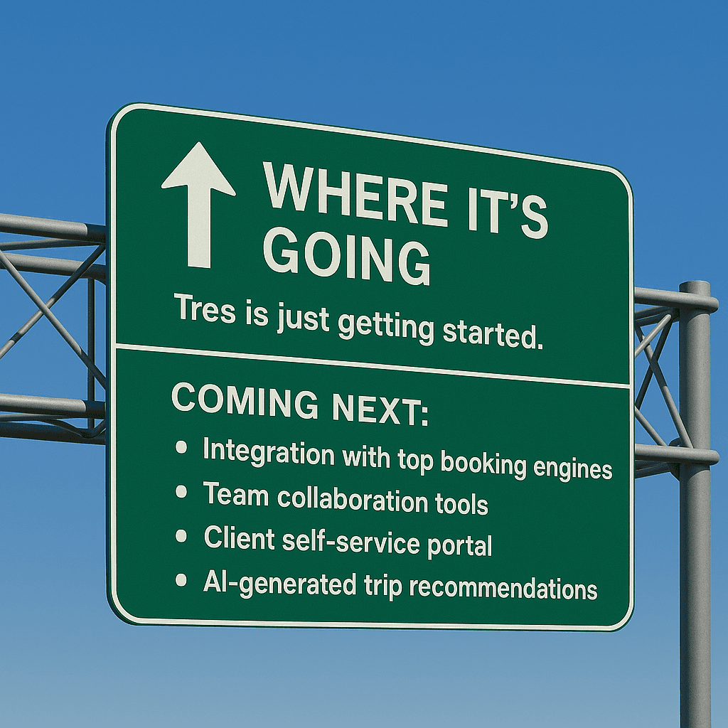
Tres isn’t just a tool it’s an upgrade to how agents work, connect, and deliver unforgettable trips.