
Listening First


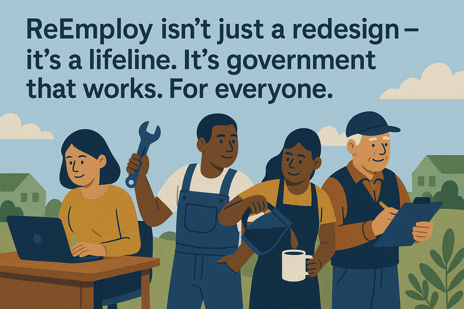
Jake runs a small handyman business with help from his son. Since COVID hit, work dried up. Now struggling to pay bills, he urgently needs financial support but finds the process overwhelming and confusing.

Abby recently lost her job as a retail manager. She’s anxious, unsure if she qualifies for help, and feels stressed navigating unfamiliar systems to get back on her feet.

Rodrigo is a sharp, tech-savvy exec laid off after company downsizing. He wants fast, clear access to benefits but gets quickly frustrated with slow systems and vague instructions
Finding the Gaps

· Over 20 screens just to file a claim
· No personalization
· Legal jargon everywhere
· Not responsive
We realized: it wasn’t the users who were failing the system.
It was the system that was failing the users.
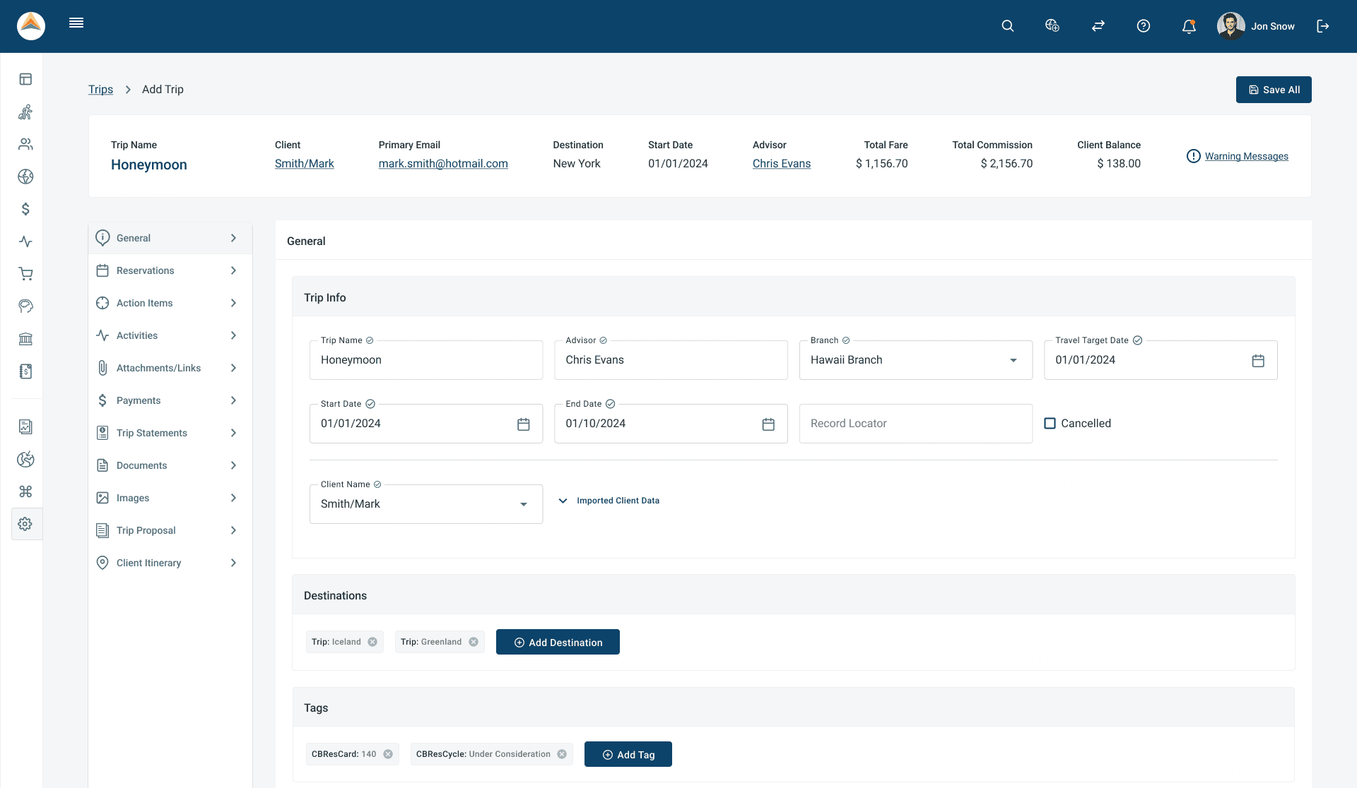
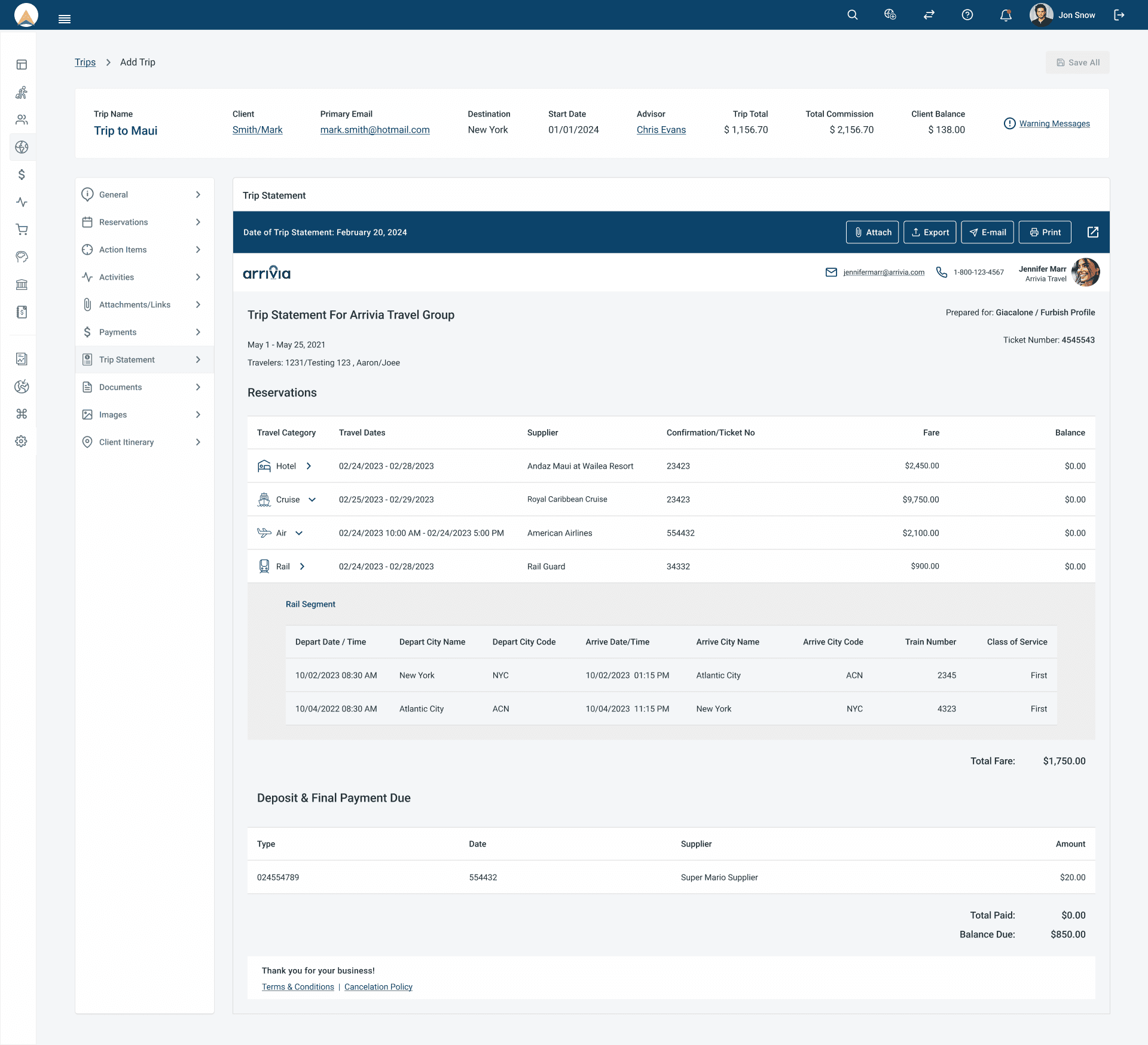
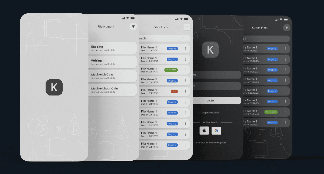
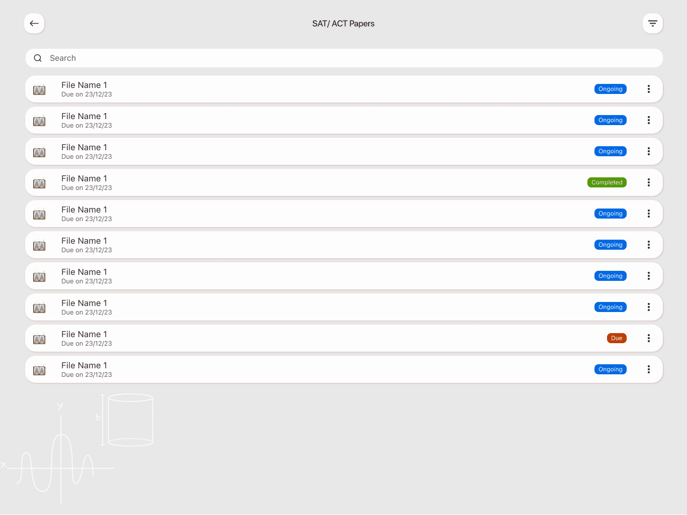
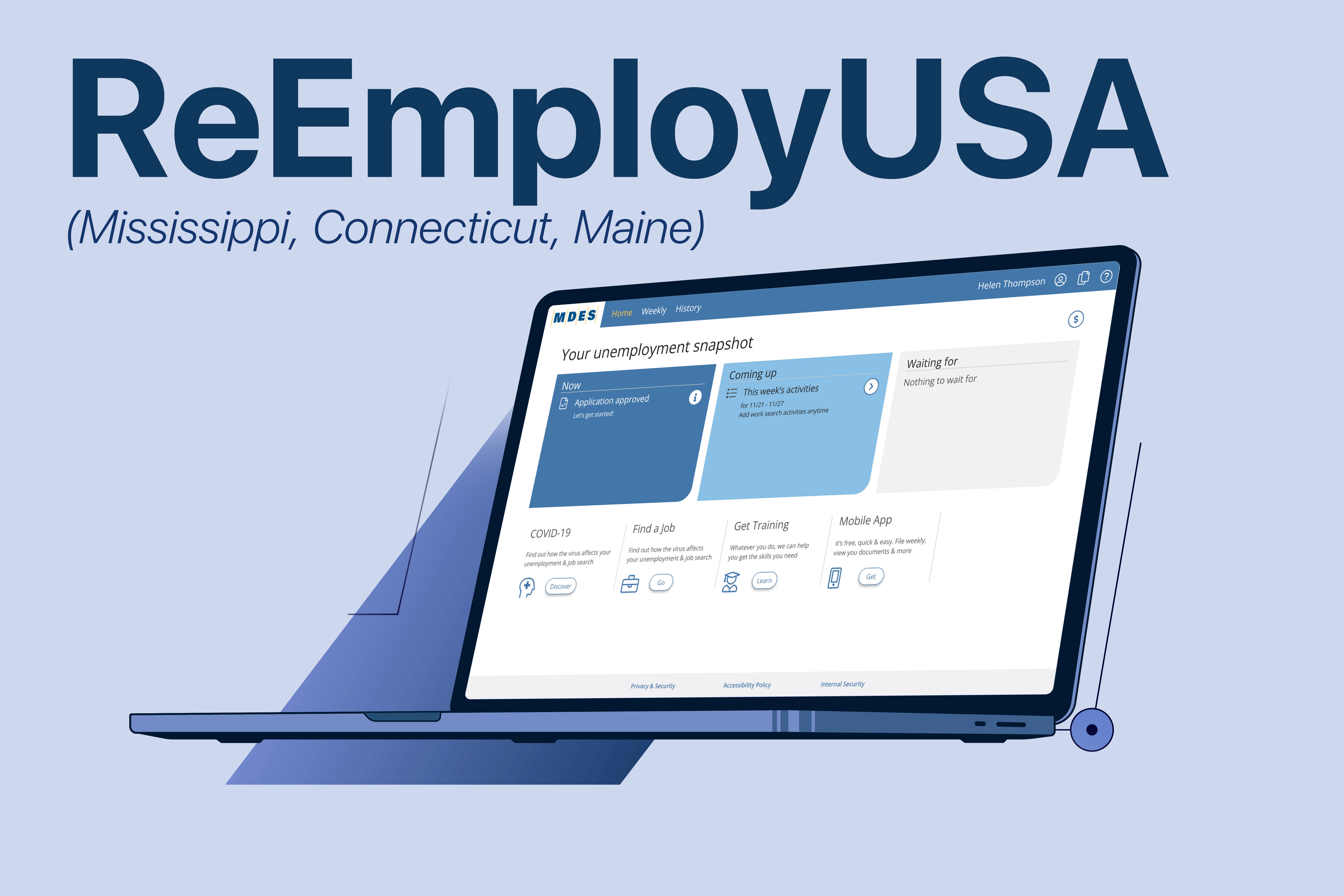
What We Built
· A 3-step onboarding that sets expectations
· Personalized checklists
· Contextual hints and color-coded action cards
· A history view for transparency
· Mobile-first design for accessibility
We removed 60% of unnecessary screens - and replaced confusion with confidence.

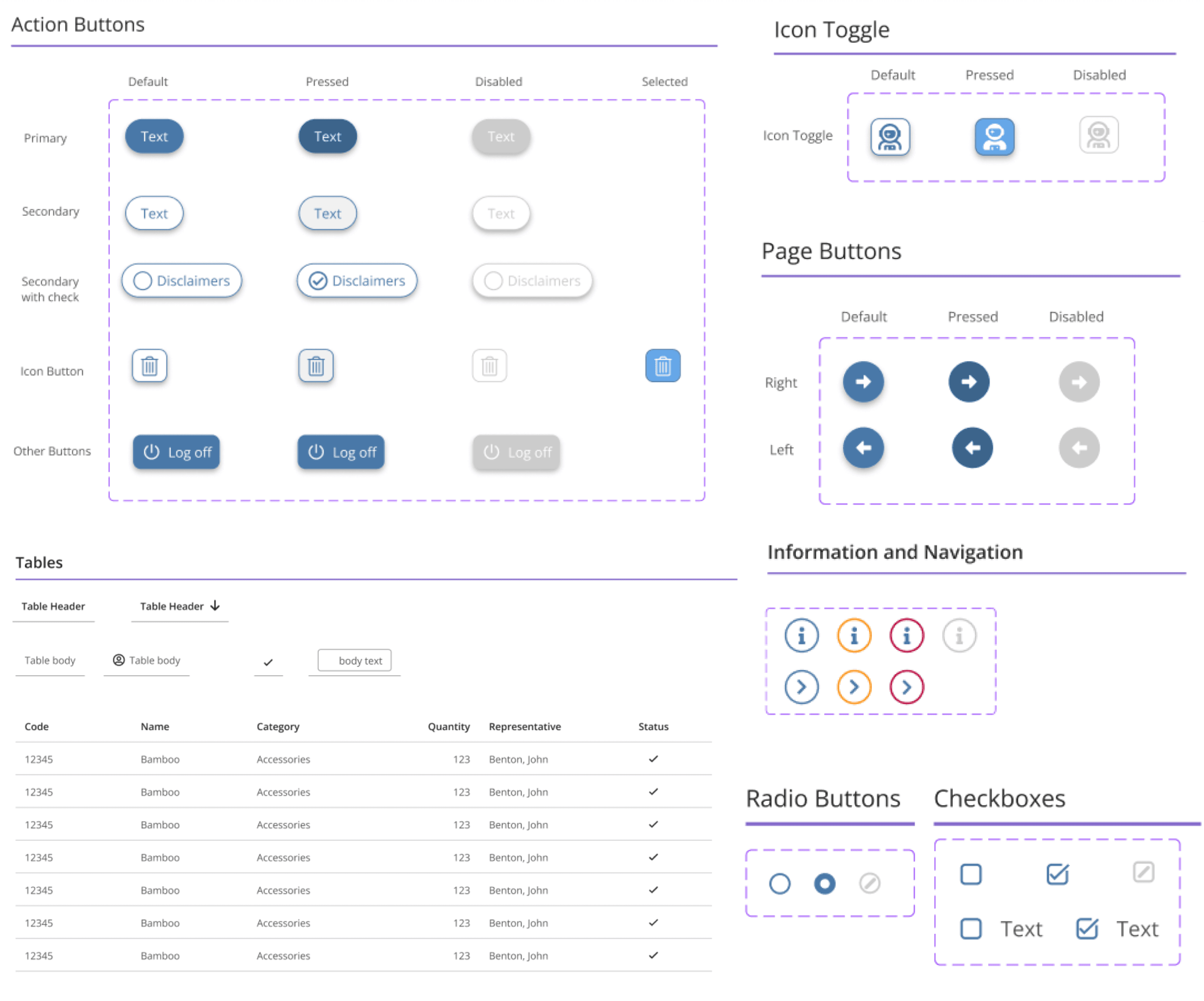
Components
How It Works

What We Learned (and Fixed)
· “I didn’t know what to do next” → We added visual guidance and reminders
· “I couldn’t see it on my phone” → We made it fully mobile responsive
· “It felt like a black hole” → We gave users real-time updates and status views
The result?
A system people could actually use - and trust.
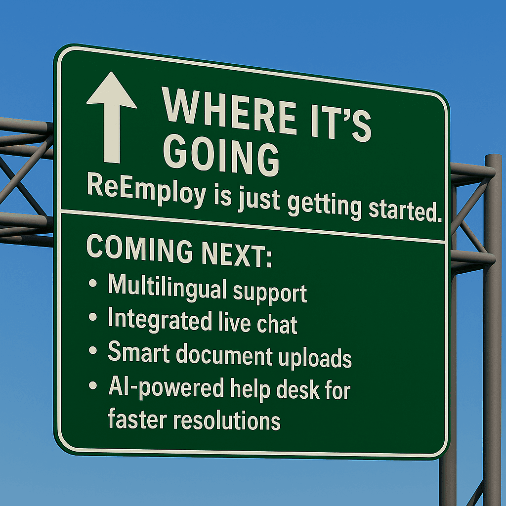
Why It Matters
Unemployment is already hard enough. The system shouldn’t make it harder.