
Introduction
Introduction
Project
Project
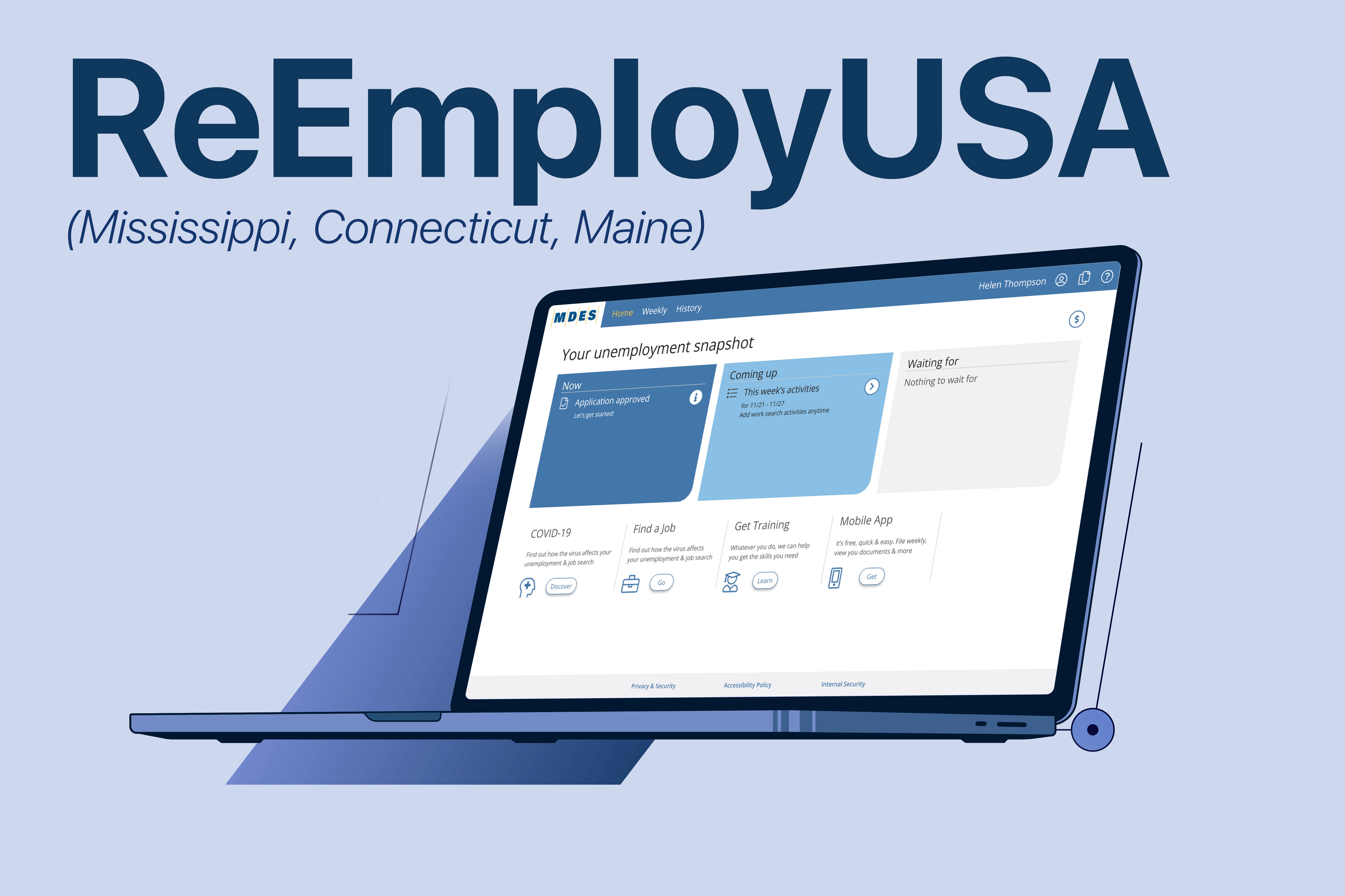
ReEmploy USA is an unemployment assistance platform used by multiple U.S. states, including Mississippi, Maine, and Connecticut. During the COVID-19 pandemic, these states experienced a dramatic increase in unemployment claims, exposing major usability issues in their legacy system, which was full of redundant screens, outdated flows, and unclear instructions.
The goal of this project was to reimagine the claimant experience, while preserving much of the existing backend infrastructure.

Team
Team
Design: UX Design Director, UX Lead, UX Researcher, UX Designer (my role)
Engineering: 5 Frontend & Backend Developers, 1 Tech Lead
Product: 1 Product Owner per State
Project Management: 1 Project Manager
Design: UX Design Director, UX Lead, UX Researcher, UX Designer (my role)
Engineering: 5 Frontend & Backend Developers, 1 Tech Lead
Product: 1 Product Owner per State
Project Management: 1 Project Manager
Timeline:
Timeline:
3 Years
Tools
Tools

Adobe XD
Adobe XD

Figma
Figma

MS Excel
MS Excel

MS Teams
MS Teams
Research & Discovery
Research & Discovery
This phase focused on understanding user pain points, workflow inefficiencies, and opportunities for improvement across the claimant journey.
This phase focused on understanding user pain points, workflow inefficiencies, and opportunities for improvement across the claimant journey.
User Interviews
User Interviews
We interviewed over a dozen stakeholders, including mentors, coordinators, and team leads from the call centers in all three states. These stakeholders had firsthand knowledge of system pain points and claimant frustrations.
We interviewed over a dozen stakeholders, including mentors, coordinators, and team leads from the call centers in all three states. These stakeholders had firsthand knowledge of system pain points and claimant frustrations.
Key Pain Points Identified

Overly complicated menu structure with too many, often unclear options
Overly complicated menu structure with too many, often unclear options
Unclear and overly complex language not suitable for an eighth-grade reading level
Unclear and overly complex language not suitable for an eighth-grade reading level
Repetitive and inconsistent screens
Repetitive and inconsistent screens
No onboarding or guidance for first-time or cognitively impaired users
No onboarding or guidance for first-time or cognitively impaired users
Agents could not view or understand the full claimant journey and inefficiencies that led to poor claimant outcomes and operational overhead
Agents could not view or understand the full claimant journey and inefficiencies that led to poor claimant outcomes and operational overhead
Unfriendly system UI caused the #1 reason for call center traffic.
Unfriendly system UI caused the #1 reason for call center traffic.
“There’s too much info on each screen; users don’t know what to read.”
– CSR
“There’s too much info on each screen; users don’t know what to read.”
– CSR
User Personas

Jake
Jake
Handyman
Handyman
Jake is a hardworking handyman who operates his small business with help from his son. They had steady work until COVID hit, and the business took a serious blow. Without it, Jake and his family struggle to cover bills and groceries. He never envisioned retirement and now urgently seeks financial support and direction.
Jake is a hardworking handyman who operates his small business with help from his son. They had steady work until COVID hit, and the business took a serious blow. Without it, Jake and his family struggle to cover bills and groceries. He never envisioned retirement and now urgently seeks financial support and direction.
Goals
Get unemployment benefits quickly and reliably
Learn what assistance he qualifies for
Regain financial stability for his household
Goals
Get unemployment benefits quickly and reliably
Learn what assistance he qualifies for
Regain financial stability for his household
Challenges
Limited experience with professional processes and terminology
Easily overwhelmed by documentation and confusing instructions
Urgency and stress make it hard to stay focused
Challenges
Limited experience with professional processes and terminology
Easily overwhelmed by documentation and confusing instructions
Urgency and stress make it hard to stay focused
Abby
Abby
Retail Manager
Retail Manager
Abby recently lost her job as a retail manager and feels anxious about her future. She’s never been unemployed before and worries about whether she’s eligible for benefits. The uncertainty of the process, along with financial strain, leaves her feeling scared and stressed.
Abby recently lost her job as a retail manager and feels anxious about her future. She’s never been unemployed before and worries about whether she’s eligible for benefits. The uncertainty of the process, along with financial strain, leaves her feeling scared and stressed.

Goals
Secure unemployment benefits without legal issues
Understand what certifications are needed to get a new job
Regain her sense of independence and stability
Goals
Secure unemployment benefits without legal issues
Understand what certifications are needed to get a new job
Regain her sense of independence and stability
Challenges
Fear of doing something wrong in the application process
Finds the system confusing and unclear
Stressed about making ends meet
Challenges
Fear of doing something wrong in the application process
Finds the system confusing and unclear
Stressed about making ends meet

Rodrigo
Rodrigo
Businessperson
Businessperson
Rodrigo is a young, ambitious former corporate executive who lost his job during company downsizing. Tech-savvy and confident, Rodrigo wants to get back on track fast, but often gets frustrated with inefficient systems or unhelpful processes. He values clarity and speed.
Rodrigo is a young, ambitious former corporate executive who lost his job during company downsizing. Tech-savvy and confident, Rodrigo wants to get back on track fast, but often gets frustrated with inefficient systems or unhelpful processes. He values clarity and speed.
Goals
Access benefits quickly to maintain financial stability
Use tech-savvy tools to streamline applications
Stay informed about options and next steps
Goals
Access benefits quickly to maintain financial stability
Use tech-savvy tools to streamline applications
Stay informed about options and next steps
Challenges
Easily frustrated by unclear instructions
May come across as argumentative when facing delays
Wants more control over the experience and outcomes
Challenges
Easily frustrated by unclear instructions
May come across as argumentative when facing delays
Wants more control over the experience and outcomes
Touchpoint Analysis
Touchpoint Analysis
We analyzed over 20 key user tasks across the claimant journey, including applying for unemployment, uploading documents, certifying for weekly benefits, and filing appeals.
Each touchpoint was mapped with columns for:
We analyzed over 20 key user tasks across the claimant journey, including applying for unemployment, uploading documents, certifying for weekly benefits, and filing appeals.
Each touchpoint was mapped with columns for:
Frequency, User drivers (e.g. "I lost my job and don’t know what to do"), Info context, Design patterns (suggest, master-detail, timeline, etc.), CSR involvement, UX recommendations
Frequency, User drivers (e.g. "I lost my job and don’t know what to do"), Info context, Design patterns (suggest, master-detail, timeline, etc.), CSR involvement, UX recommendations
1.
Apply for unemployment: Needs clear entry point and checklist.
Apply for unemployment: Needs clear entry point and checklist.
2.
Calm my fears: Users need status, what’s next, and when money is coming.
Calm my fears: Users need status, what’s next, and when money is coming.
3.
Weekly certs: Users forget what they’ve already submitted or if it went through.
Weekly certs: Users forget what they’ve already submitted or if it went through.
4.
Calm my fears: Users need status, what’s next, and when money is coming.
Calm my fears: Users need status, what’s next, and when money is coming.
5.
Upload documents: Confusion about where/how to upload - resulting in delays.
Upload documents: Confusion about where/how to upload - resulting in delays.
We used these to define system patterns like “suggest,” “timeline,” and “confirm,” and prioritized simplification + error prevention.
We used these to define system patterns like “suggest,” “timeline,” and “confirm,” and prioritized simplification + error prevention.
Ideation and Concept Development
Ideation and Concept Development
Problem Statement
Problem Statement

Legacy unemployment systems confuse and overwhelm users, especially during emotionally vulnerable times, leading to high call volumes, incomplete applications, and low user confidence.
Legacy unemployment systems confuse and overwhelm users, especially during emotionally vulnerable times, leading to high call volumes, incomplete applications, and low user confidence.
Objective
Objective

Design a claimant-focused experience that uses clear, simple language - easily understandable by someone with an eighth-grade education - while guiding users step-by-step through the system. The platform also needed to be fully responsive, delivering a seamless and accessible experience across both desktop and mobile devices.
Design a claimant-focused experience that uses clear, simple language - easily understandable by someone with an eighth-grade education - while guiding users step-by-step through the system. The platform also needed to be fully responsive, delivering a seamless and accessible experience across both desktop and mobile devices.
Feature Ideation
Feature Ideation
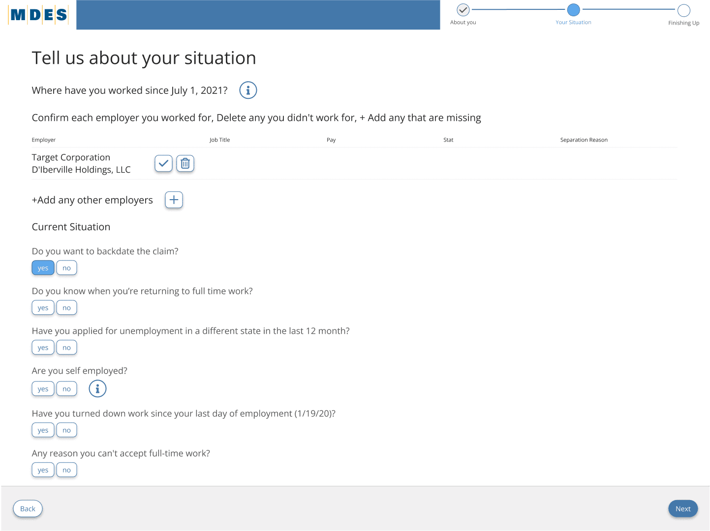
Provided an overview of how the system works, Introduced key documents and required information, Delivered a checklist and clear next steps
3-step induction process introduced at the beginning of the claimant journey
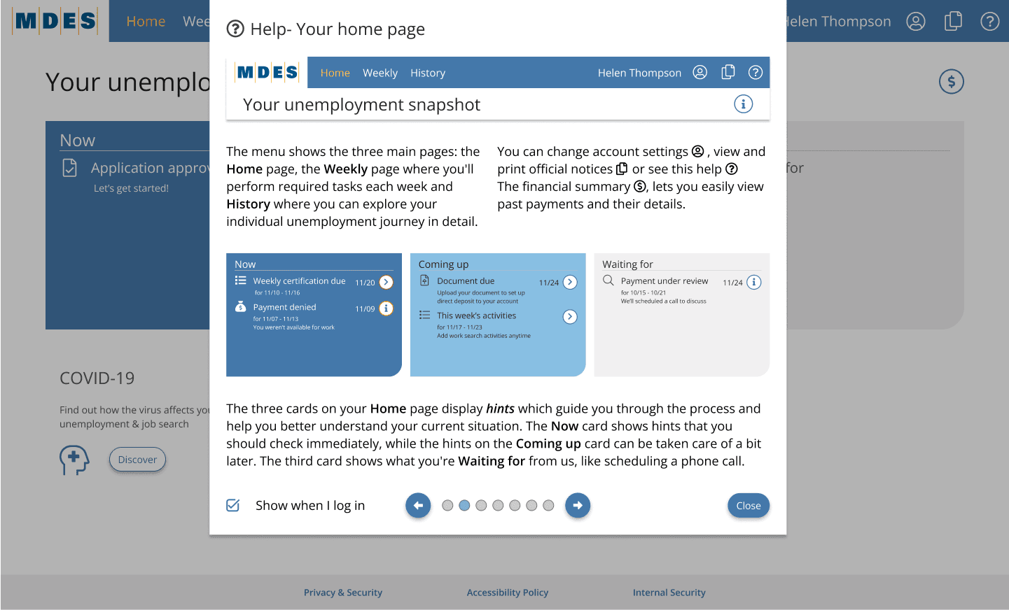
Homepage milestone cards - Now, Coming Up, and Waiting For cards on the homepage to help users quickly understand where they are in the process and what needs to be done next
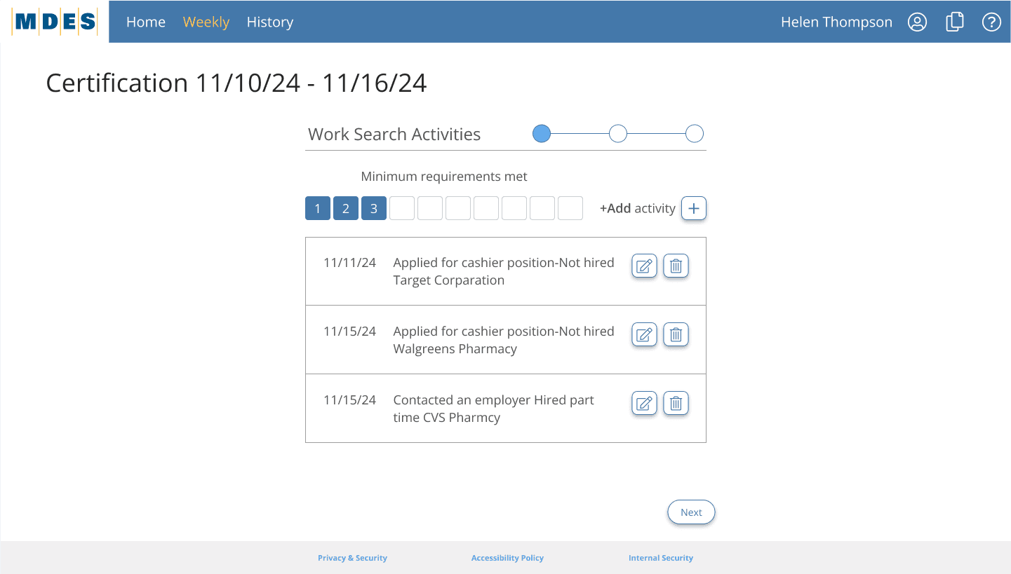
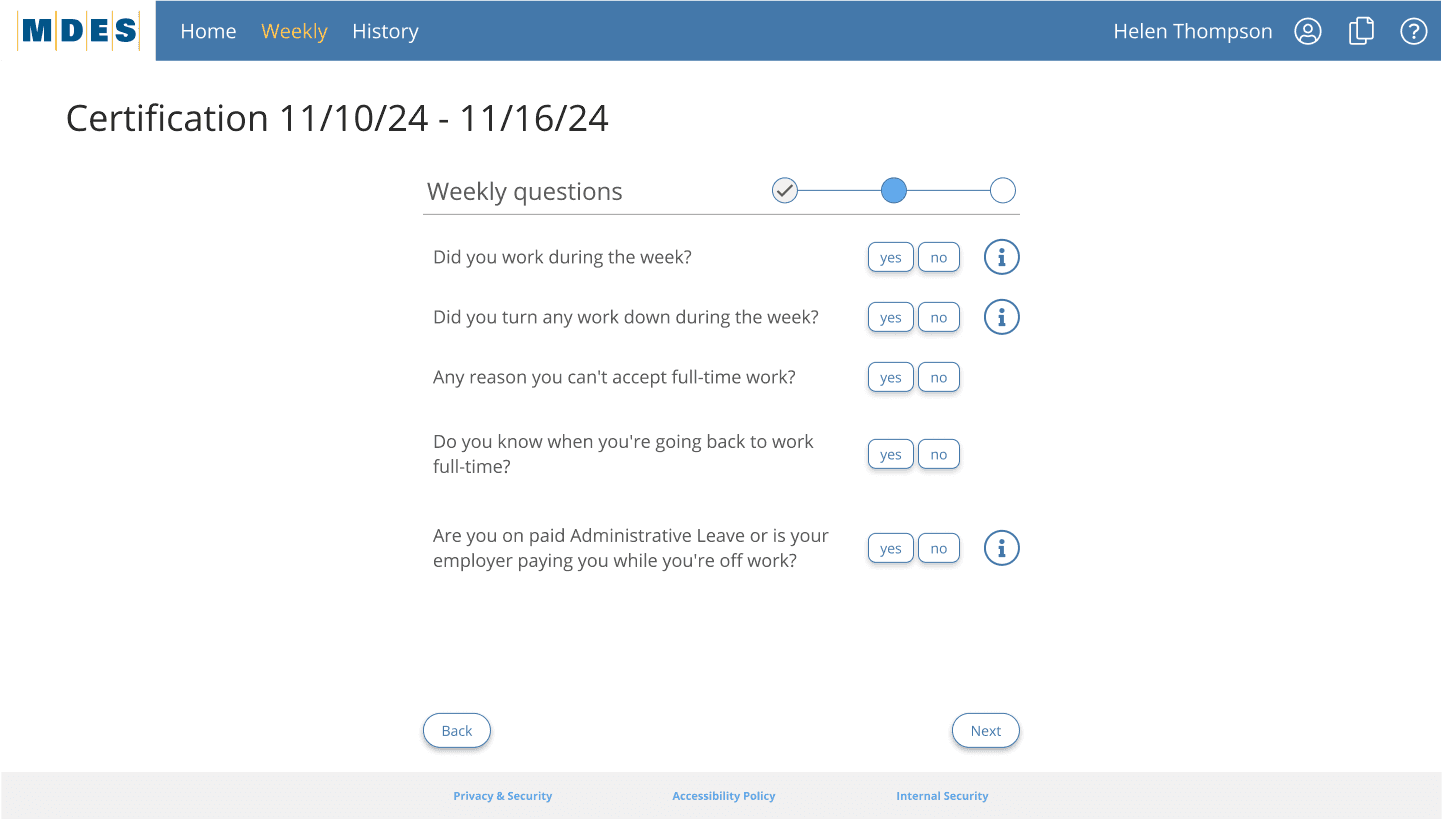
Weekly submission tracker with status
One-page weekly certification flow
Embedded contextual help (glossary, hints)
Hints and tooltips to offer real-time explanations without overwhelming the UI
History section to let users review all past actions and submissions in one place
Color-coded action buttons on the homepage indicating urgency or required attention
Provided an overview of how the system works, Introduced key documents and required information, Delivered a checklist and clear next steps
3-step induction process introduced at the beginning of the claimant journey
Homepage milestone cards - Now, Coming Up, and Waiting For cards on the homepage to help users quickly understand where they are in the process and what needs to be done next
Weekly submission tracker with status
One-page weekly certification flow
Embedded contextual help (glossary, hints)
Hints and tooltips to offer real-time explanations without overwhelming the UI
History section to let users review all past actions and submissions in one place
Color-coded action buttons on the homepage indicating urgency or required attention
Concept Exploration
Concept Exploration
We explored several approaches using rapid prototyping and internal testing:
We explored several approaches using rapid prototyping and internal testing:
A card-based layout for navigation clarity
A card-based layout for navigation clarity
Timeline cues for tracking application progress
Timeline cues for tracking application progress
Help modal persistent on each screen
Help modal persistent on each screen
Information Architecture
Information Architecture
We restructured the overall claimant experience based on actual user behaviors, mental models, and journey mapping data. The redesigned architecture aimed to:
We restructured the overall claimant experience based on actual user behaviors, mental models, and journey mapping data. The redesigned architecture aimed to:
1.
1.
Group related actions under intuitive headers
Group related actions under intuitive headers
2.
2.
Remove redundancies across steps
Remove redundancies across steps
3.
3.
Break down long, confusing screens into digestible flows
Break down long, confusing screens into digestible flows
4.
4.
Align pages with what claimants were trying to accomplish
Align pages with what claimants were trying to accomplish
5.
5.
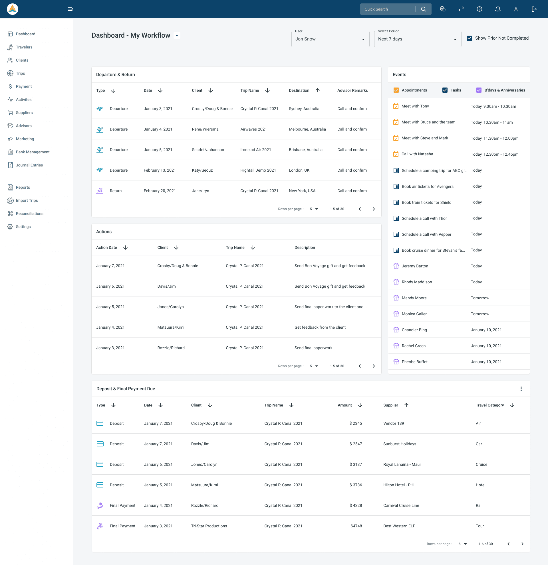
The homepage was built around three clear categories:
Now: Tasks requiring immediate action
Coming Up: Scheduled or expected next steps
Waiting For: Pending decisions or agency actions
The homepage was built around three clear categories:
Now: Tasks requiring immediate action
Coming Up: Scheduled or expected next steps
Waiting For: Pending decisions or agency actions
6.
6.
We also reduced visual clutter by:
Limiting the number of visible menu options
Consolidating help and resource sections
Replacing text-heavy pages with progressive steps and checklist-driven navigation
We also reduced visual clutter by:
Limiting the number of visible menu options
Consolidating help and resource sections
Replacing text-heavy pages with progressive steps and checklist-driven navigation
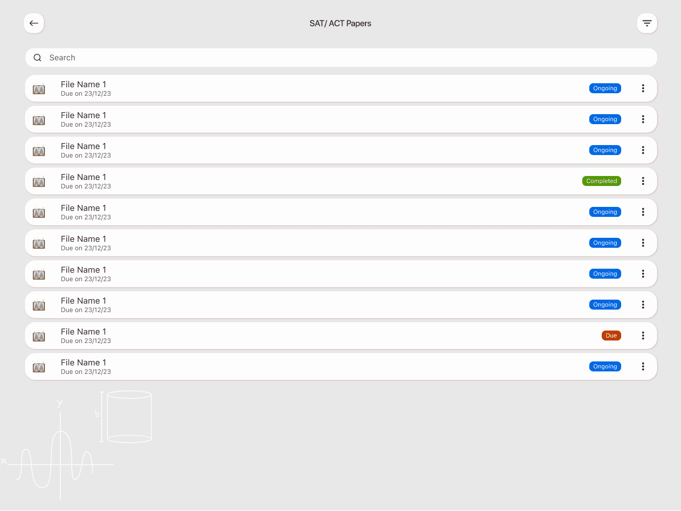
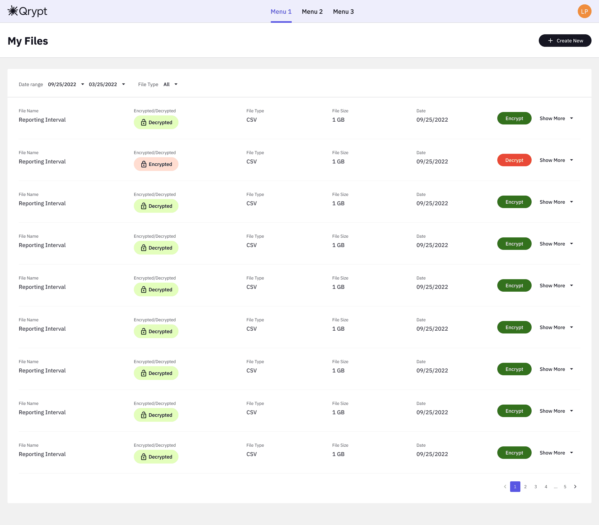
Legacy systems often had over 20 screens to complete a claim; we brought this down to a streamlined, structured journey, with all key flows cross-referenced and supported by CSR documentation
Legacy systems often had over 20 screens to complete a claim; we brought this down to a streamlined, structured journey, with all key flows cross-referenced and supported by CSR documentation
Visual and Interaction Design
Visual and Interaction Design
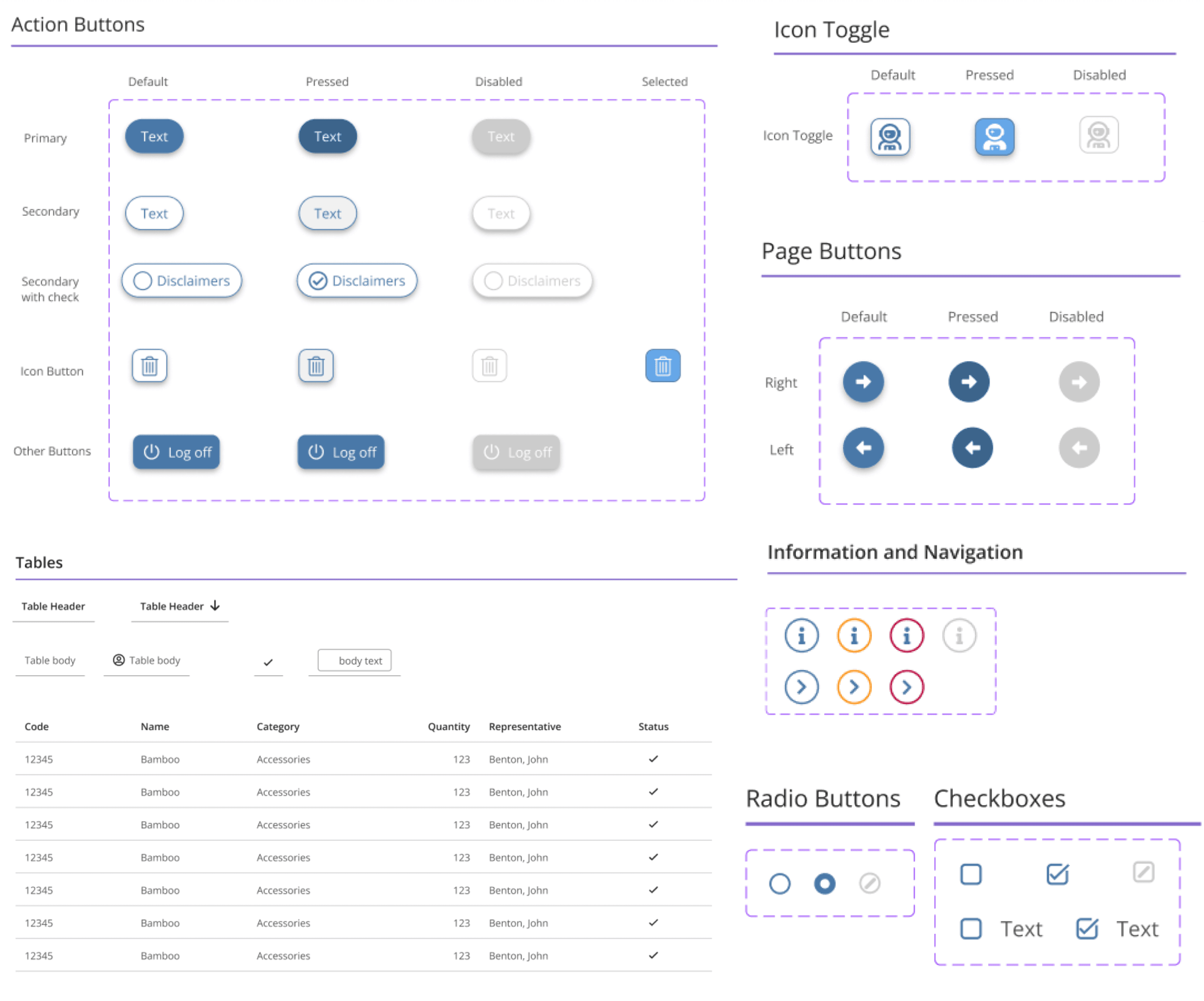
Design System
Design System
Typography & Colours
Primary Font
Primary Font

Color Palette
Color Palette

Components
Components
Hi-Fi Screens
Hi-Fi Screens


Prototyping and Testing
Prototyping and Testing
Prototype
Prototype

Usability Testing & Iteration
Usability Testing & Iteration
24 participants were selected (balanced by tech-savviness, age, and employment type).
Findings:
Claimants instantly engaged with the centered Current Card
Most misunderstood the Save Marketing Tile name
Needed clearer terms for "History" and "Upload"
Iterations:
Added onboarding microcopy
Renamed ambiguous buttons
Added section dividers inside timeline and history
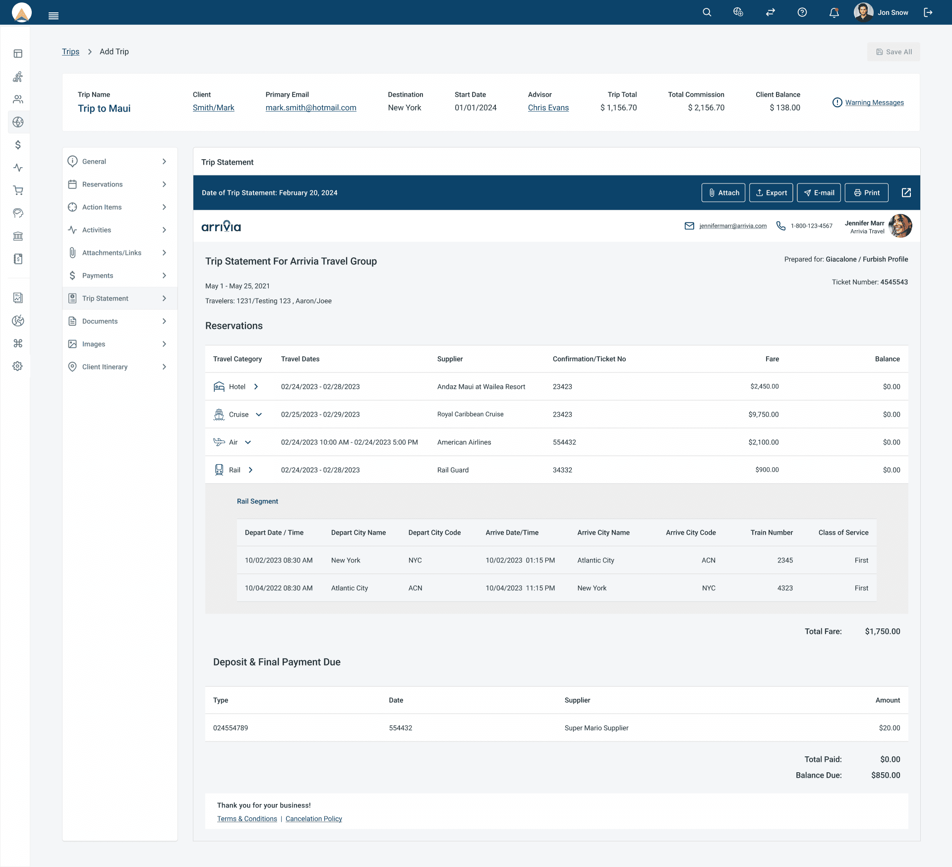
Final Implementation
Final Implementation
Final Outcome & Metrics
Weekly claim submissions increased by 47%
CSR call volume dropped by 39% within 3 months
Claimant task success rate improved from 58% to 91%
Average time to complete application reduced by 45%
Before & After Comparison
Old Design
New Design


Challenges & Solutions
Challenges & Solutions
Challenge 1:
Challenge 1:
Problem: Legacy backend constraints
Problem: Legacy backend constraints

Solution: Retained logic but modernized UI wrapper
Solution: Retained logic but modernized UI wrapper
Challenge 2:
Challenge 2:
Problem: Repetitive screens
Problem: Repetitive screens
Solution: Merged similar screens using progressive disclosure
Solution: Merged similar screens using progressive disclosure
Challenge 3:
Challenge 3:
Problem: Users with low tech literacy
Problem: Users with low tech literacy
Solution: Added icons, glossary, and smart defaults
Solution: Added icons, glossary, and smart defaults
Challenge 4:
Challenge 4:
Problem:
Inconsistent page layouts |
Problem:
Inconsistent page layouts |
Solution: Established a design system and standardized templates
Solution: Established a design system and standardized templates
Challenge 5:
Challenge 5:
Problem: CSR alignment across states
Problem: CSR alignment across states
Solution: Built shared language into components and tooltips
Solution: Built shared language into components and tooltips
Challenge 6:
Challenge 6:
Problem: Redundant menu paths
Problem: Redundant menu paths
Solution: Simplified navigation and grouped tasks logically
Solution: Simplified navigation and grouped tasks logically
Challenge 7:
Challenge 7:
Problem: Poor orientation/no milestones
Problem: Poor orientation/no milestones
Solution: Introduced progress indicators and visual hierarchy
Solution: Introduced progress indicators and visual hierarchy
Challenge 8:
Challenge 8:
Problem: Lack of glossary/help
Problem: Lack of glossary/help
Solution: Embedded contextual guidance throughout the journey
Solution: Embedded contextual guidance throughout the journey
Challenge 9:
Challenge 9:
Problem: Emotional overwhelm from UI
Problem: Emotional overwhelm from UI
Solution: Applied tone-friendly content and reduced cognitive load
Solution: Applied tone-friendly content and reduced cognitive load
Next Steps
Next Steps
Develop multilingual support (Spanish, Vietnamese, Somali)
Develop multilingual support (Spanish, Vietnamese, Somali)
Add chatbot and virtual agent
Add chatbot and virtual agent
Expand CSR dashboard for better tracking & escalation
Expand CSR dashboard for better tracking & escalation
Conclusion
Conclusion
The ReEmploy USA redesign wasn’t just about streamlining UI—it was about humanizing an essential government service at a time when people were at their most vulnerable. By blending empathetic UX, research-driven design, and stakeholder alignment, we built a solution that is not only easier to use but also restores trust and autonomy in the unemployment process.
The ReEmploy USA redesign wasn’t just about streamlining UI—it was about humanizing an essential government service at a time when people were at their most vulnerable. By blending empathetic UX, research-driven design, and stakeholder alignment, we built a solution that is not only easier to use but also restores trust and autonomy in the unemployment process.
I love working with teams who care about great design and smart solutions.
Got something in mind?
Tamara Hansani © 2025
I love working with teams who care about great design and smart solutions.
Got something in mind?
Tamara Hansani © 2025
I love working with teams who care about great design and smart solutions.
Got something in mind?
Tamara Hansani © 2025